Thursday, May 29, 2008

Rvw: Tekkonkinkreet


If there is one thing the Japanese animation industry seems to thrive off of, it's the graphic novel adaptation. Only recently in America have graphic novels become 'approved' to move onto the big screen--granted that most of it has been produced as live action, but the entertainment industry has just started coasting down the giant hill of comic book culture. While several of these adaptations that involve animation remain chained to the small screen, Japan has released a wave of animated full lengths that have washed over their borders and soaked the international market. Miyazaki (creator of Spirited Away, Howl's Moving Castle, and many childhood favorites) has become a familiar name on the tongues of audiences all over the world. Several of his most successful films were adaptations of novels (mostly illustrated, not necessarily graphic): Kiki's Delivery Service is the animated adaptation of the novel of the same name by Eiko Kadono, Nausicaa of the Valley of the Wind is Miyazaki's own graphic novel sent to screen, and his newest film Howl's Moving Castle is his take on the fantasy novel by Diana Wynne Jones.
Several cartoon series run in Japan are merely moving versions of their mangas (Japanese equivalent of a comic book), several of which bear full length films to diverge or even lump together several issues at once, but in 2006 Michael Arias and Studio 4°C adapted Taiyō Matsumoto's three volume manga Black and White into one of the most beautiful blends of sight, sound, and story ever seen, renamed Tekkonkinkreet.

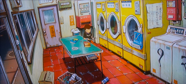
The story focuses on two orphans named Black and White. After spending years adapting to the streets, they begin to feel an ownership over their city, Treasure Town, and earn the fear and respect of locals, as well as the name The Cats. As the city begins to grow and develop, the boys find themselves trying to fend off groups of gangsters (yakuza), challenges for their title, and evading the police and hired killers. The plot is simple, typical even, yet employs an expert use of simplicity. Outside of the story, the visuals are stunning to say the least. The animation studio responsible is led by one of Japan's most notable animators and directors, Koji Morimoto (handywork includes: segments from the Animatrix, Memories, Neo-Tokyo, Akria, and Miyazaki's Kiki's Delivery Service). With a soaring reputation and some of Japan's most progressive animators, the film had high expectations, all of which were met. Tekkonkinkreet's visuals have the fluidity in motion for which Morimoto is famed for and the detail and attention to background that is notable of Miyazaki. The character design is colorful and imaginative, the environments are intricate enough to mime reality, and the motion (be it fights or the ruffles of a breeze) are so gestural and seamless that you can't take your eyes off of it.
While the story may be the weak point of the film, and the animation seems overwhelming, the pace slows at times to allow simple moments of meditation. Several of these scenes tend to be some of the most emotional in the film (I'll admit I get severely choked up at a couple of parts). Tekkonkinkreet's beauty lies in the equal distribution of the motion and the still, the sound and the silent, and the aesthetic of the city and the simplicity of nature.

Friday, May 23, 2008

Assignment 4: Snap Judgments


New Concepts in African Photography.

The Snap Judgments exhibition at the Brooks Museums showed a lot of promise. The typical African artwork that comes through the Tennessee museum circuit is what most people expect: tribal war masks, wooden figurines, animal teeth necklaces, and yards and yards of brightly colored traditional African print. Yet, Snap Judgments was a breath of fresh air (albeit, teasing) for the general public. The introduction to the show promised photography devoid of the nation's "stereotypes" (poverty, famine, disease), yet the artwork present seemed to be devoid of anything definitively African. Several of the pieces seemed to emulate Western techniques and style, failing to add a national touch--it was as if a Western photographer simply shot in Africa. The real crime was not the similarities in techniques but the failure to produce such techniques through an African lens.
One piece displayed several fashion photographs accompanied by modern music videos of African artists. The style was Western, the clothes were Western, even some of the subjects were Western--and all of this was pinned straight to the wall on a crimson backdrop. The arrangement was busy and difficult to look at (especially if you're not over 5',7") and the music was distracting and equally disengaging.
Other highlights included deteriorating buildings, shells of ruins, forgotten chandeliers, and desolate looking cityscapes. The photos were beautiful but were simply lacking in attachment or a story that demands more. A particular piece of interest showed scenes from an African prison, from holding cells to inhabited tanks to the duties of a prison butcher. Long peripheral shots full of vibrant color and several subjects had enough to keep one interested,and seemed to have a more political overtone, and even initiated the grotesque--good decisions to draw in and keep a viewer. Had the message of the pieces been a bit more definitive, it could have proven to be one of the best in show.
The lack of abstract work also caused a series of let-downs in yours truly. While photography is flatly known as a representative medium, the beauty present when creating the abstract is solid and sharp. The only abstract piece present showed marks left from a soccerball on a whitewashed wall. The marks were subtle but present, it showed excellent cropping (no information of environment) and was one of my favorite pieces of the show. Sadly, there were few more like it.
Overall, while I found the show to be progressive, a few steps were missing and fulfilling the promise made at the exhibition's entrance. The disasters were not shown, some were merely toned down to the point of disinterest, yet Africa was not shown either. It was an exhibition lacking life or identity, giving me a judgment of neutrality that won't leave any taste of my mouth, be it good or bad.

PR/Bibliography

Progress: Luckily I didn't focus on the Yojimbo aspect solely because I was incorrect--Fistful of Dollars was second. It was Leone who was influenced by Kurosawa NOT the other way around. I've watched the movie a couple of times and have looked over the readings--still having problems trying to compare a spaghetti western to an american western. Need to grab that book from Rhodes, hopefully it will answer some questions and clear the air.

Current Bibliography:

"Which Way Is America?":Americanism and the Italian Western
Marcia Landy
Boundary 2, Vol. 23, No. 1 (Spring, 1996), pp. 35-59
Duke University Press

"Japanese Swordfighters and American Gunfighters"
J. L. Anderson
Cinema Journal, Vol. 12, No. 2 (Spring 1973) pp. 1-21
University of Texas Press

"Spectacles of Death: Clint Eastwood and Violence in "Unforgiven""
Carl Plantinga
Cinema Journal, Vol. 37, No. 2 (Winter, 1998) pp. 65-83
University of Texas Press

"Clint Eastwood: An Interview"
Ric Gentry and Clint Eastwood
Film Quarterly, Vol. 42, No. 3 (Spring, 1989), pp. 12-23
University of California Press

"Clint: Cultural Critic, Cowboy of Carthartic Change"
Gail Jardine
Art Journal, Vol. 53, No. 3,...An Issue to "C" (Autumn 1994) pp. 74-75
College Art Association


Now get back to work.

Thursday, May 22, 2008

Rvw: Indiana Jones and the Kingdom of the Crystal Skull


Standing in line with predominantly teenagers should have been an indicator. The drunk loudmouth kicking my chair and the shoddy costumes should have raised a red flag. Yet, nothing set off the alarms like a CG groundhog. The second the computer animated critter popped out of the ground and barely doged the wheel of a speeding car blaring Elvis, everyone who grew up hanging off of every whip-crack Harrison Ford emitted, felt their hearts drop into their stomach.

Part of the beauty of Indiana Jones was Spielberg's serial film influences and his genuine appropriation. Environments that appeared to be comprised of backdrops and constant studio lighting (full spotlighted faces) gave Indy his old world charm. Set in the fifties, the design and the political ideas were spot on with the actual aesthetic and general mindset of America in the 1950's. In the latest Indiana Jones film, Spielberg keeps his decade specific language constant, everything from Howdy Doody to Indy telling the reds, 'I like Ike'. We can still look forward to the significance of Indy's hat, the faithful theme whenever anything action packed or as meager as getting up off the ground occurs on the screen, and there's even a quote to Indiana Jone's fear of snakes.

However, the constant thrills that are to be expected from Indiana Jones while present are overshadowed by the sheer ridiculousness of the plot. Yes, there are fantastic fight scenes. Yes, Indy does what Indy does best. Yes, there are aliens and CG ants.

Big headed aliens and flesh eating computer animated ants.

The action, no matter how compelling, just doesn't stand up in the face of how terribly obvious and out of place the special effects are. There seems to be too much of need to impress the contemporary audience through flashy graphics (such as interdimensional flying saucers). There is no shame in adapting to meet the standards of a younger audience, however one should not lose themselves in appealing to a younger generation. Spielberg pulls a George Lucas here--he takes a perfectly good idea and blows the entire thing trying to imitate the flashiness of modern day Hollywood.

Surely someone has to notice that computer graphics are difficult to incorporate successfully in live action films. The first two Lord of the Rings, for example, are two of the few movies in the last ten years to almost seamlessly include computer graphics in the environment and beside the actors. Yet, in the third installment of the trilogy, the animators seem to go over the top and lose their subtlety. Sadly, subtlety is not in the vocabulary of the animators of Indian Jones.

The film is not horrible. The acting is actually the saving grace of the film. Harrison Ford, being one of the last true, dreamy, man's man actors in Hollywood, cannot deliver anything but excellence. Even the kid from Transformers does a good job (I'd remember his name, but I'm too caught up in the fact that he was on Disney's Even Stevens). Go see the movie for Ford's sake--being long in the tooth and still moving like the same Indiana Jones deserves merit.

Tuesday, May 20, 2008

Assignment 3:I learned it from watching you!

In the growing war against drugs, the airways are riddled with constant PSAs preaching the horrors of drug use. Several of these commercials are aimed at teens and children (with the occasional parental guilt trip). These blips do nothing but reinforce all of the myths we are taught in school.
Any red blooded American who has attended college (or the 'crazy' high school party) knows the general gist of marijuana usage. Naturally, several of these commercials are focusing on marijuana. This is quite possibly because it is the most widely used drug in the United States (dare I say-the world), yet it is the drug surrounded by the most ridiculous misconceptions.
The marijuana smoker is most often portrayed as lazy (literally deflated), neglectful, irresponsible, and completely out of touch with the world. In this little gem of a PSA, the lethargic pothead is approached by her dog. Not only does her dog miss her, but this longing manifests the power of human speech to dear Fido.


Many will tell children and teens everyday that marijuana can cause you to hallucinate, chase Technicolor earth spirits off of the edge of a cliff, in front of a car, down the stairs...basically that the visions induced by smoking/ingesting marijuana can lead to a life threatening mistake to the influenced in motion. If a car crash is not implied ("You are threatening everyone's life when you get behind the wheel high."), then why can't you be so high that your dog can talk to you?

Of course this isn't what the commercial is trying to say, but it's fun just to think about it. It's almost as amusing as the implication that potheads are too lazy to go outside--either they are too lazy or the sun is just too much for their fried brain to handle.

If any Memphian has been near Overton Park on the fourth of April, knows full well that a marijuana user is not against going outside. Furthermore, I think they enjoy being outside even more. The anti-drug crowd however does not mention any of the overweight kids chained to the tv while their parents find some other way to avoid spending time with them (new video games and Saturday morning specials are most effective). I don't know about you, but I'm not buying that marijuana makes you so lazy that you can't stand to walk outside. Nor do I believe that it instill vampiric qualities to drug users.

Another all-time favorite is from the 1980's. Although the message is rarely touched upon in contemporary anti-drug culture, the 80's liked to not only guilt their teenagers, but also the parents.


This holds a bit more water in my book. Sure, if you see your parents huffin' a fatty in the living room, curiosity can get the better of you. You may try it. You also may pick up you parents' radio listening habits and start stealing ties from your father. Any person who's parents do drugs usually don't credit their drug usage to their parents. They can brag about smoking with their parents, but I'm sure it's about as exciting as getting drunk with your parents. Toke up with Dad with a couple of your buddies around and be prepared to have him:

a)fall asleep
b)share embarrassing stories of your childhood while simultaneously making fun of your friend's hair
c)complain that 'new' weed just isn't the same as 'old' weed

Also be prepared to find your parents pinching from your stash.

It's simply not ethical for a kid to mimic everything their parents do. By the time you are a teenager you're trying to do everything BUT what your parents are doing. It could have been a starting point, but chances are the novelty will wear off if your parents are 47-ish and can't seem to shake the urge to pop up every time you're trying to smoke with your friends.

Whether you partake of not, few people take the message of anti-drug commercials seriously--probably because they are so concerned with stopping marijuana usage instead of focusing on heroin, cocaine, crystal meth, prescription medication--you know, the things that have racked up a death toll. Scare me straight by showing me clips of infected track marks, not by showing me talking dogs and kids who were probably too lazy to leave their house in the first place.

Friday, May 16, 2008

Presentation Proposal.

Kurosawa is one of the great modern appropriators. In his film 'Yojimbo', he takes Sergio Leone's story 'A Fistful of Dollars' and adds Japanese elements such as samurai mercenaries and a village mafia. I would like to compare the original Italian spaghetti Western, a take on Western 'cowboy' culture, to a further appropriation involving Eastern culture. How does these constant cultural filters affect the overall of the American west and the American Western hero? Does this result in a dilution? Does one director succeed more in the area of proper representation where another fails? Is there such a thing as a 'successful representation' of a time that is mostly compiled of over embellishment and tall tales? I aim to access whether Kurosawa is attempting to merely borrow Leone's story and place it in an Asian context, adding extra layers through his cultural lens, or if he is simply paying homage to a favored piece.


w/c:154

Wednesday, May 14, 2008

Assignment 2: Gorky's 'The Plough and the Song'


Although the piece 'The Plough and the Song' can be considered minimal, the treatment of the background does not lend itself to the typical minimal nature. Instead of a flat ochre background, Gorky breaks up the negative space with a variation of midrange yellows with several different techniques of material application. Gorky pushes his anamorphic masses by surrounding them with a membrane of a light, flat, yellow tone. A color palette of reds, greens, blues to define the amoeba like forms that are strung together by thin, hairlike growths. Gorky's composition is centralized but by placing elements in three corners of the picture plane he avoids creating visual stagnation.
The piece calls to mind artists such as Miro, yet avoids overcrowding the composition. Gorky groups his forms in fours and fives, varying in size and opacity, from solid and razor edged to softened and compiled of it's own value scale.

The color palette falls into the earth tone category, yet relates to the imagery Gorky is creating. Similar to